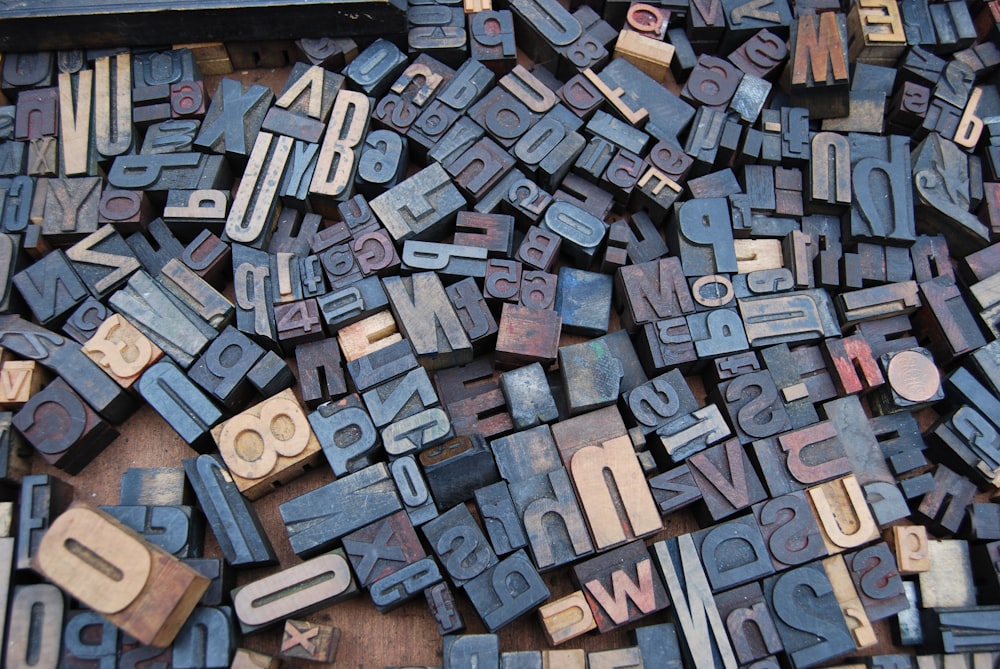
Hawaii Website Design – Everything You Need To Know About Typography
Previously, we talked about Essential Tips in Choosing the Right Color Scheme for Your Website. Today, we will talk about the the basics of typography and why it’s important. Typography is a fundamental component of design and one of the primary ways of communication. Typography has undergone numerous improvements. Currently, there are thousands of fonts and typefaces that can be seen on the internet.
The usage of typography is one of the essential things in business, design, and marketing today. Here are the things you should know about typography:
-
Type families.
If you do not know what type families are then you would not be able to identify fonts and their types. Since you are in website design, you have to know what type families are. It is important because typing is what you do most in web design.
For every font style, each has a different type family. Some of the type families are: Regular, Italic, Condensed Black, and Condensed Bold.
-
Typeface.
Usually, people mix up type face with font. However, these are two different things. Font pertains to a particular member of a type family while typeface refers to the style of a font. In web design, you need to select typefaces that best fits the theme you’re going for. Typeface has two main categories: the Serif Font and the Sans Serif Font.
A serif is a small line/ stroke commonly attached to the end of a larger stroke in every letter or symbol. It is usually used in books because it guides the eyes from letter to letter. On the other hand, San Serif doesn’t use a serif. This typeface is easier to read on websites.
-
Size.
Using different sizes can ultimately influence the design and its message. It is necessary to use different sizes when you want to give emphasis on certain parts. For an instance, in a newspaper, the headlines are consistently larger than the text of the content. In web design, you will find it very helpful to use various font sizes.
-
Alignment.
You might think this is less important than the others but it is not. It is actually one of the most crucial things to consider. To know which kind of alignment to use, you have to consider its readability and the aesthetic of the design. You have to be consistent when you use a certain alignment. You don’t want to confuse your audience. Here are different types of alignment:
Flush Left – often referred to as “left justified”, left aligned text starts each line along the document’s left margin. As a result, you have a straight margin on the left but a ragged margin on the right.
Flush Right – commonly referred to as “right justified”. Contrary to flush left, this alignment begins along the right margin of the document. Correspondingly, you will have a straight margin on the right and a ragged margin on the left.
Justified Alignment – a combination of the left and right aligned text. The result when you use justified alignment in your document is a straight margin on both sides.
Centered Alignment – as the name indicates, it begins on the center of each line. As you continuously type, the text expands evenly to both sides, leaving the same amount of margin.
-
Choosing secondary fonts.
It is boring if you use a single font all throughout. You have to choose a good secondary font that will is complementary to your primary font. To avoid confusion, make sure to use different fonts but see to it that it is a good combination. If you don’t choose a good secondary font, the overall aesthetic will be ruined.
Now that we’ve tackle the things you need to know about typography, we will discuss about finding the perfect font for your website next.